Eunos_Cosmo
Forum Addict
- Joined
- Oct 7, 2007
- Messages
- 6,968
- Location
- Oakland
- Car(s)
- '84 Mazda RX7, '12 Mazda 2, '99 Porsche Boxster
I like the original. It's dark and mysterious.

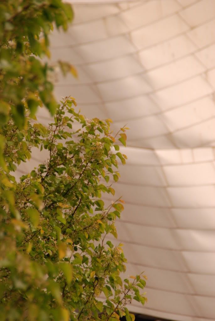
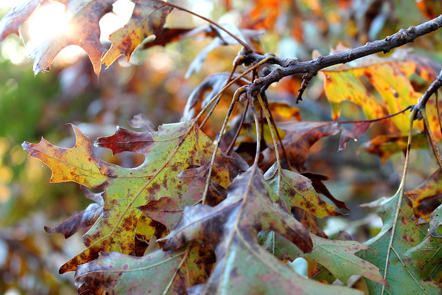
Not sure, might also be one of a few things: two separate rows of trees at different depths of field (photo was taken across a tree-lined street), or soft lighting on the facade of the building (it was a relatively cloudy day).
I think you misunderstood me, I was suggesting that they could be and it would be interesting.
")
Taken with a Canon 600D with a 50mm F1.8 lens, Please let me know what you think.
https://pic.armedcats.net/s/sa/santaji/2011/06/18/IMG_0220.jpg
Oooh didn't know about this thread, since I'm a newbie at this, maybe someone can critque some of mine. Don't be afraid to tell me they suck or something either, I can take it.:lol:
Unprocessed, 1/80, f/5.6 55mm
Unprocessed, 1/100, f/10, 18 mm