Richmondgal
Well-Known Member
- Joined
- Feb 19, 2008
- Messages
- 2,858
- Location
- Melbourne, Australia
- Car(s)
- Still a Hyundai...but this time an i30
Really keen to hear what you guys say about this one I posted in Lens Flair a few days back:


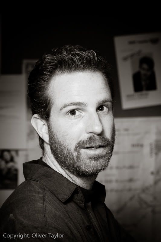
Didn't have much of a choice :lol: It was extremely dark and I spent most of the night shooting at max iso @ f/1.8 @ 1/50-1/60A lot of pictures were not perfectly focused, even the few that I shot with flash because it still had to focus in the dark.
I'd say either focus on his face or have his face much further out of focus. Either works, but as it is right now, my eyes don't know where to look. Also, on-camera flash ... ew.
Waddaya think? Too cliche?
Really keen to hear what you guys say about this one I posted in Lens Flair a few days back:
Great B&W, I like the composition and everything!Really keen to hear what you guys say about this one I posted in Lens Flair a few days back

I really like it.
Where/what is that?
I like the symmetry of whatever that is, and I think you could definitely get a great shot at this location but the pole in the center is a fairly boring and not very well defined focal point due to the narrow aperture that makes the viewer focus on the incredibly boring background, also the highlights in the cloud in the lower left corner of the sky and 1/4 of the way up the center pole on the right side look blown out. This probably sounds dumb and i'm not sure how to explain it but I also dislike images that are angled upward to show a high up object/sky that are composed to look like the bottom of the image is at a straight/direct angle for a sort of phony wide angle shot.
Exif IFD0
* Camera Make = Canon
* Camera Model = Canon EOS 50D
* X-Resolution = 240/1 ===> 240
* Y-Resolution = 240/1 ===> 240
* X/Y-Resolution Unit = inch (2)
* Last Modified Date/Time = 2009:11:20 19:58:30
* Artist = Oliver Taylor
* Copyright Owner = Copyright: Oliver Taylor
Exif Sub IFD
* Exposure Time (1 / Shutter Speed) = 1/250 second ===> 0.004 second
* Lens F-Number / F-Stop = 56/10 ===> ?/5.6
* Exposure Program = manual control (1)
* ISO Speed Ratings = 400
* Exif Version = 0221
* Original Date/Time = 2009:11:20 18:50:02
* Digitization Date/Time = 2009:11:20 18:50:02
* Shutter Speed Value (APEX) = 7965784/1000000
Shutter Speed (Exposure Time) = 1/250 second
* Aperture Value (APEX) = 4970854/1000000
Aperture = ?/5.6
* Exposure Bias (EV) = 0/1 ===> 0
* Max Aperture Value (APEX) = 3/1 ===> 3
Max Aperture = ?/2.83
* Metering Mode = partial (6)
* Flash = Flash fired, compulsory flash mode
* Focal Length = 70/1 mm ===> 70 mm
* Original Subsecond Time = 96
* Digitized Subsecond Time = 96
* Focal Plane X-Resolution = 4752000/894 ===> 5315.44
* Focal Plane Y-Resolution = 3168000/597 ===> 5306.53
* Focal Plane X/Y-Resolution Unit = inch (2)
* Custom Rendered = normal process (0)
* Exposure Mode = manual exposure (1)
* White Balance = auto (0)
* Scene Capture Type = standard (0)
^you have to wait for the guy that posted above you to recieve minimum 1 feedback, then it's your turn.
Nice idea, but the background is distracting.
If you cropped it so you can just see the sky and the pole, it would be fine. It's just that there's too much background matter lingering on the bottom. Nice sky and concept though.
I like the symmetry of whatever that is, and I think you could definitely get a great shot at this location but the pole in the center is a fairly boring and not very well defined focal point due to the narrow aperture that makes the viewer focus on the incredibly boring background, also the highlights in the cloud in the lower left corner of the sky and 1/4 of the way up the center pole on the right side look blown out. This probably sounds dumb and i'm not sure how to explain it but I also dislike images that are angled upward to show a high up object/sky that are composed to look like the bottom of the image is at a straight/direct angle for a sort of phony wide angle shot.
It's a great shot, there is a whole lot of detail and a clear emphasis on the man's face, there really isn't anything wrong with it other then some lost detail from the flash blowing out the face. This is about as good a result as anyone could expect from a candid portrait in "point and shoot mode", but there isn't anything particularly special about it, while it may be perfectly executed, it's just a face against a dark flat background.Any more criticism?