
You are using an out of date browser. It may not display this or other websites correctly.
You should upgrade or use an alternative browser.
You should upgrade or use an alternative browser.
Lens Flair
- Thread starter Overheat
- Start date
napoleondyna
Well-Known Member
- Joined
- Jul 27, 2006
- Messages
- 914
- Location
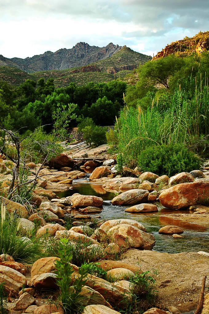
- Tucson, AZ
- Car(s)
- 1966 MBZ 250SE (W108), 1987 BMW 535i (e28)
ALXBWSCREW
Well-Known Member
- Joined
- Dec 9, 2008
- Messages
- 1,693
- Location
- Germanistan
- Car(s)
- Fiat Barchetta, Alfa Romeo 156, Opel Zafira
^that's spledind!

Last edited:
oh shi- Grand Canyon photos are usually boring ("hey, look! It's the Grand Canyon!") but that is just... whoah. Also proof that sunny days are overrated.
+rep for awesome shot and having it in full res. Desktop material, ho!
+rep for awesome shot and having it in full res. Desktop material, ho!
Last edited:

That's quite simply awsome. Did I hear Ansel Adams?")
Ansel Adams....wah, that's quite a complement! Even though it really doesn't even come close at all.:lol:
IceBone
Blue Wheel Hipster
Ansel Adams modified exposure by hand, not just by bumping the clarity slider.
Ansel Adams modified exposure by hand, not just by bumping the clarity slider.
I don't think one is better than the other. They are both means to achieve a certain feel within the picture. All roads lead to Rome. Having said that, tremendous respect for Ansel Adams and his pictures.

IceBone
Blue Wheel Hipster
Black and white photos really bring out the contrast fakery (no insult intended). If you want to make the clouds pop more, try turning the luminance of the blue channel when turning the photo black and white (which means using the black and white tool, not just desaturating).
Werner
Well-Known Member
- Joined
- Oct 22, 2005
- Messages
- 1,106
- Location
- The Netherlands
- Car(s)
- '11 Toyota Aygo; '07 Honda CB600F Hornet

Top Geek
Forum Addict
Great Canyon shot, indeed!
https://pic.armedcats.net/e/ep/epp_b/2009/07/16/2009-07-15_Little_Piper.jpg
https://pic.armedcats.net/e/ep/epp_b/2009/07/16/2009-07-15_Little_Piper.jpg
ALXBWSCREW
Well-Known Member
- Joined
- Dec 9, 2008
- Messages
- 1,693
- Location
- Germanistan
- Car(s)
- Fiat Barchetta, Alfa Romeo 156, Opel Zafira
Black and white photos really bring out the contrast fakery (no insult intended). If you want to make the clouds pop more, try turning the luminance of the blue channel when turning the photo black and white (which means using the black and white tool, not just desaturating).
I think I do need to spend some more time to bring out the clouds a bit more, it looks a bit washed out comparably. Thanks.
LeVeL
Forum Addict
- Joined
- Jun 16, 2007
- Messages
- 13,246
I think I do need to spend some more time to bring out the clouds a bit more, it looks a bit washed out comparably. Thanks.
I think that Ice's comment was directed at me... not that it really matters lol. I'll try to fix mine later
I think that Ice's comment was directed at me... not that it really matters lol. I'll try to fix mine later
argh, my bad...
I think I do need to spend some more time to bring out the clouds a bit more, it looks a bit washed out comparably. Thanks.
dude, what
*kept that typo because I thought it was funny
Last edited: