Nati
Viva Las Clarksonistas!
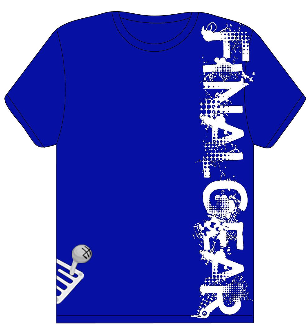
http://img89.imageshack.**/img89/3471/ggtw.jpg
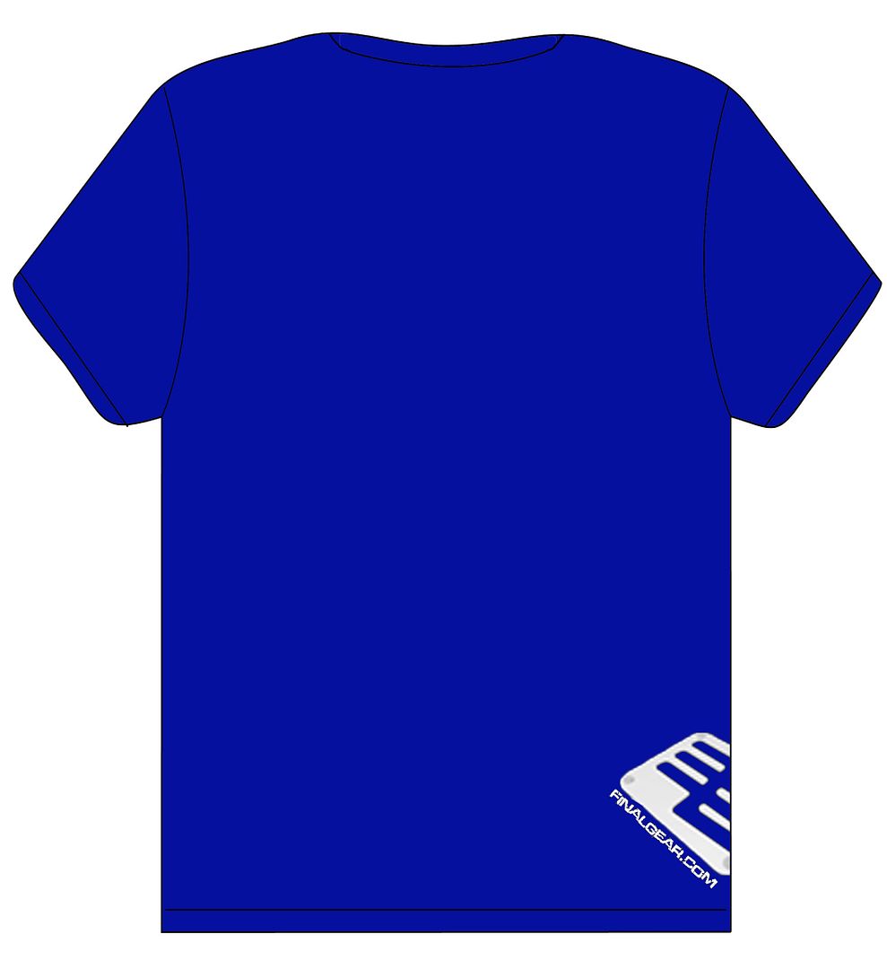
http://img134.imageshack.**/img134/3408/ggt3.jpg
I?d wear any of these


http://img89.imageshack.**/img89/3471/ggtw.jpg
http://img134.imageshack.**/img134/3408/ggt3.jpg
the oversteer one only works if you have a definition for understeer in there aswell...
otherwise the whole "oversteer is best" doesn't make sense.
matt2000 said:They look good, but #3 needs tweaking to make the English fully understandable and add capital letters.


They will go up for vote, take orders, and be printed. The top couple shirts will be printed (Could be 2, could be 5, or even 10. Depends on how sweet they are, along with the demand).
Final choice of the winner rests with the sole discretion of FinalGear.com i.e., if we choose we can simply ignore all your votes and pick what we like, but so far we go with what people want.
Working on something, thought I would show off what I have done so far to see what people think. Very simple. I am going to try a horizontal version, with the FG logo in the lineup with legendary or something else underneath.
http://img198.imageshack.**/img198/7330/fgtee.jpg
salguod's design wins hands down for me. Except, I'd remove the text. Just leave the silhouettes and a small fg logo somewhere, if at all.