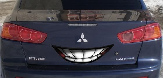
Hey coco how about this for the Landoomer

Ha!
...
no.
This is why I'm sometimes thankful for my hand-crank windows. I don't think I ever have to worry about them not working, no matter how many miles go on my Truck, or how many times they go up and down.
Now I'm wondering what GM's window hardware looks like. It seems like every GM car I've known with power windows has them get stuck, quit working, or completely lose contact with the switch at some point in time. My guess is that the whole thing must be made of Swiss cheese, and for the lulz, GM left a few hungry mice in the doors to eat away at it.
Those cars made me appreciate low-tech roll-up windows.
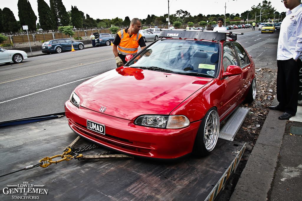
At least they didn't turn it into neo-patriot tacky:
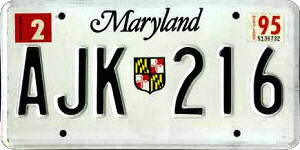
For reference, this piece of tasteful metal stamping was what we had before:
Neo-patriot tacky notwithstanding, at least the color palate is better. I did like Maryland's old plates, though. Why are license plates all over going to vomit-worthy designs that look like they were done by first graders who just discovered clip art? Simpler is better.
This is the image of the new plates that was passed around the internet when they came out:
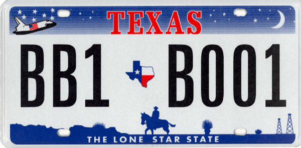
It's...revolting. What's with the mountains? Ours are nestled waaaaayyyyyy out in the Western part of the state. Worse yet, these look completely generic, as if those mountains could have been shot out the side of a plane in Colorado, New Mexico, Oregon, or...who cares? How many freaking states have mountains on their plates? I liked Texas' previous design for highlighting some of what makes the state unique with a mostly unobtrusive design. See:
Spaceship, cowboy, oil rigs--hell yeah. All rendered in a tasteful two-tone color scheme of dark blue and bright red. Unless your car is Barbie pink, it's probably going to look okay with this.
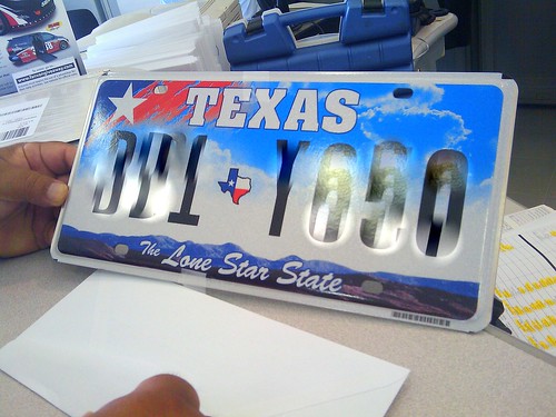
The new one is "oh, great, another state with freakin' mountains." Perhaps they realized that this was a boring idea that's been done on almost every other state's plate in the history of the United States, so to add insult to blandness, they threw up some clip art nonsense in the corner. It doesn't even match the style of the rest of the plate, for crap's sake. It looks like something that was stolen off of a mid-90s visitor's bureau's frame-addled homepage. The kind of godawful creations that equated simulated brush patterns with...hell if I knew. They looked tacky in the 90s and now they look dated and tacky.
For some reason, this design got voted as the lesser-of-all-evils when they opened it up for an online vote. Either the other options looked even worse, or we're a state full of people with bad eyes and/or bad taste. At least the color palate of the proposed design looked mildly inoffensive. Lo and behold, when they got around to printing the damn things:
MY EYES. THEY HURT. They're freaking turquoise. Look, if the sky is ever turquoise, I'm staying inside for fear that a radioactive beam has hijacked our planet and is towing it into the sun for some alien species' amusement. That's just not natural.
Worst of all, it looks freaking
hideous on my car.
Perhaps the powers-that-be over custom plate designs must've rigged the vote or fiddled with the brightness and saturation settings before printing. They've given us a damn fine reason to get something that's not...this.

It'll be weird if rickhamilton gets a good car. Would the inexplicable optimism about things that are probably awful go away with the Saturn?
I've never heard of anything like that happening. Not on FinalGear. Nope, never.
This...I'd never feel good selling the car on, I wouldn't have wanted to be sold a car like that...karma, morals and all that jazz
Au contraire! I don't think LeMons racers care about crazy things like "working odometers."
Or was it:
I'm on campus in (my dads) Aston! Please Lord, don't let him find out!
I saw the student sticker on the back. The depressing part is that it's probably just another tool to one-up the Land Rovers on the lot.
'Tis a pity. I'd beat on that like a drum. Terrifying four passengers in impeccable style? Yes. Yes,
please.


 I think it's prettier in person than it is on TV, which is saying a lot because it's freakin' gorgeous on TV.